A Better Way to Display Long Content (with an Outlook Mail Use Case)
Introduction
When building canvas apps in Power Apps, one of the most common challenges is handling long-form content efficiently. Whether you're displaying email bodies, lengthy descriptions, or detailed records, the default controls often fall short. In this article, I'll walk through designing a proper scrollable container that handles dynamic content gracefully, using an Outlook mail reader as a practical example.
The Problem with Default Controls
Power Apps provides several controls out of the box — text labels, galleries, and HTML text controls. However, each has limitations when dealing with long content:
- Label controls don't support scrolling natively and can overflow beyond the screen.
- Galleries are excellent for lists but become cumbersome when displaying single, long text blocks.
- HTML Text controls offer some flexibility but lack fine-grained control over scrolling behavior and styling.
These limitations become especially apparent in scenarios like email readers, document viewers, or form submissions where users need to read through extensive content without losing context or experiencing poor UI/UX.
Solution: Building a Custom Scrollable Container
The solution involves combining multiple Power Apps controls strategically to create a seamless scrolling experience. Here's the architecture:
- A container component that wraps the content
- Proper height calculations based on content length
- Scroll bars that appear only when needed
- Responsive design that adapts to different screen sizes
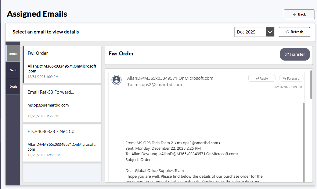
Use Case: Outlook Mail Reader
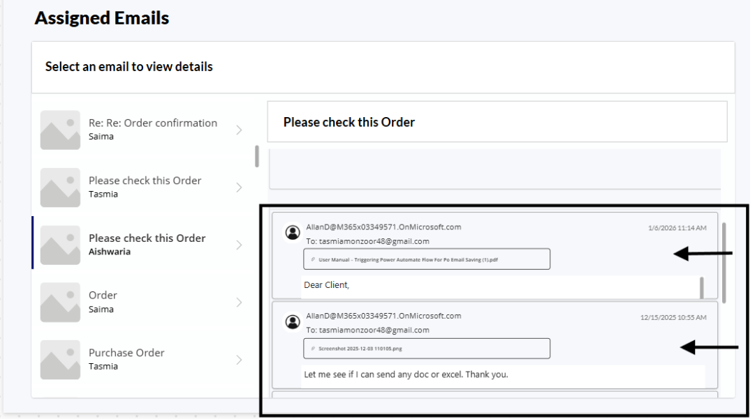
When you're redesigning something like an Outlook mail screen in Power Apps, the goal is simple: show the full email body in a way that feels natural to the user. Real email bodies don't fit neatly into fixed heights — they can be short one-liners or multi-paragraph essays. Yet, when we place that content inside a gallery or a fixed card, the result is often:
- Text gets cut off
- Scrolling only shows part of the content
- The bottom of the message is missing
- Users get frustrated
This happens because galleries and fixed-height containers don't grow with the text — they force content into a small space. What's needed instead is a container that actually scrolls to the end, no matter how much text there is.
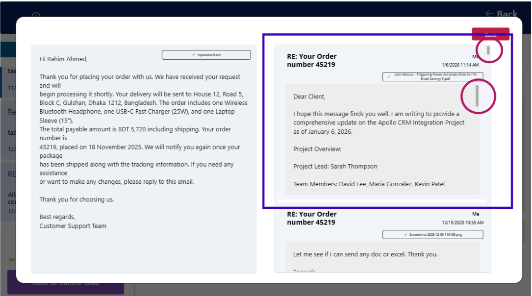
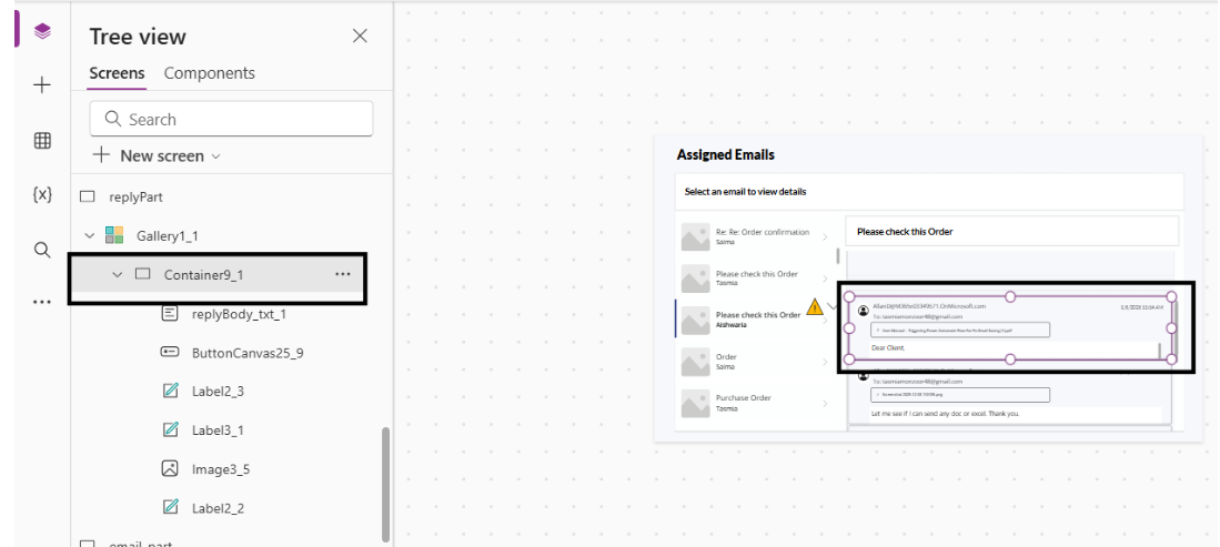
Here we can see the replies text containers are too short and it is stuck inside a smaller place. So the solution is to make the container scroll until the full message reveals inside it clearly, then the next item should be shown. Let's implement it:
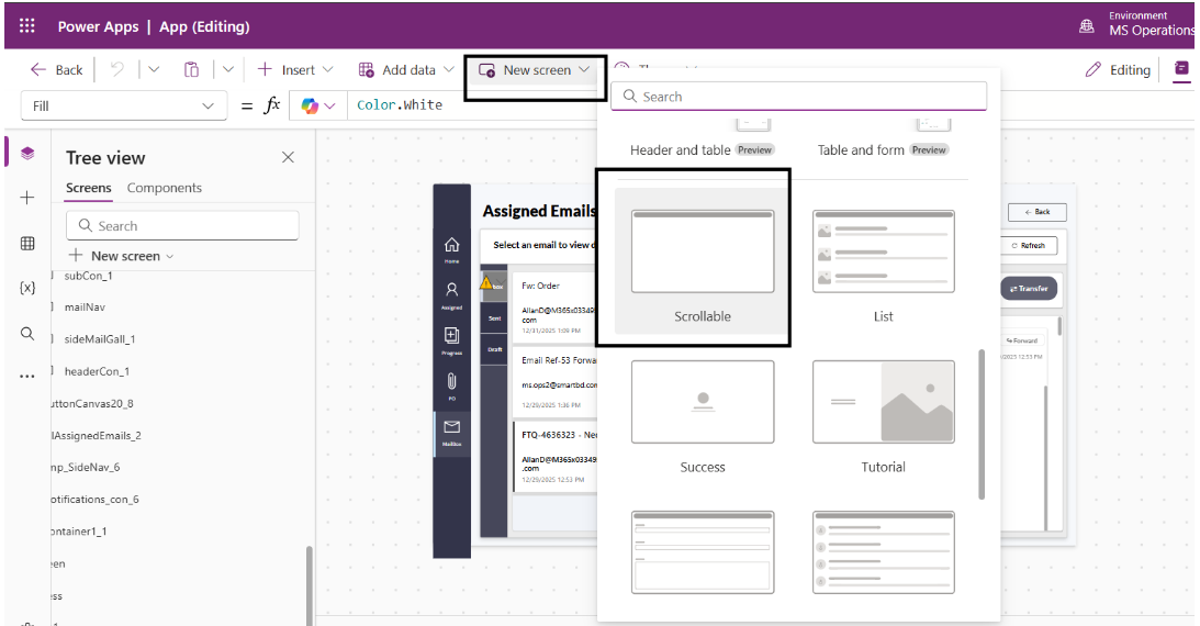
Step 1: Create a Scrollable Screen
Let's take a scrollable screen first from the New screen option. This will give us a scrollable card. This makes anything inside it scrollable.
Step 2: Quick Designing
Now let's do a quick designing:
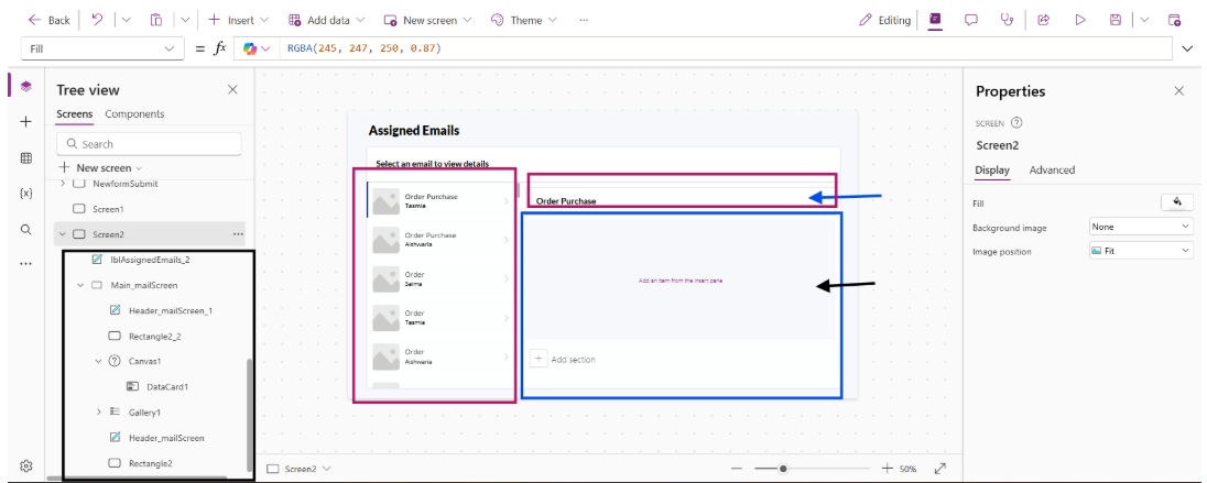
- Screen Fill: RGBA(245, 247, 250, 0.87)
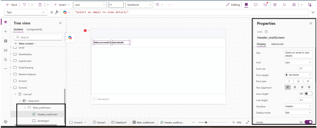
- Add a label and in the Text property: "Assigned Emails"
- Add a container, a header title and a Vertical gallery to make it look like Outlook mail gallery
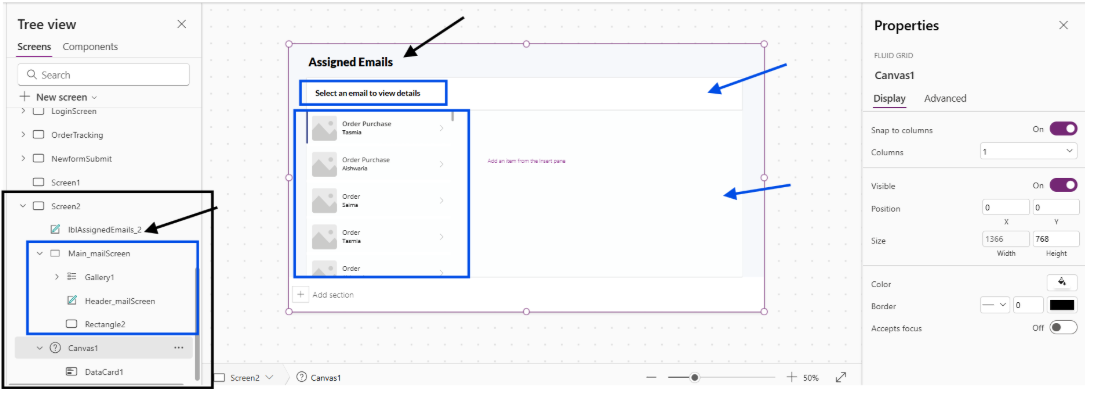
Now cut the Canvas and paste it inside the container right part. This is the part where we will see all the email body texts and replies just like Outlook. (Wait till we design!)
Inside this add a rectangle and a label for the heading.
Next I have added a vertical gallery and connected with my list for Data.
Now the upper rectangle is the subject of the selected mail from the gallery. Now we need to see the mail contents inside the scrollable part. Make the card longer — it is now scrollable till the end. Now let's add a container inside the card. One for email and one for reply.
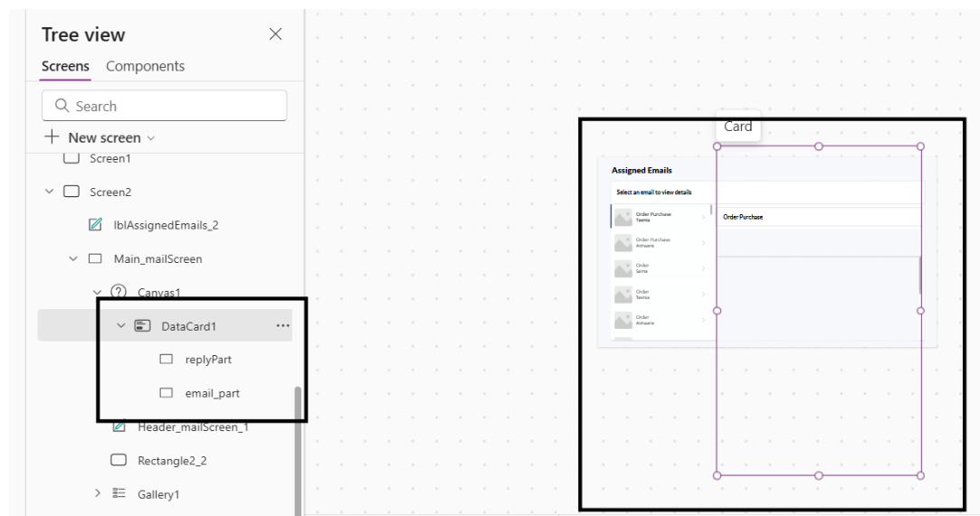
First place the email container, then scroll down and put the reply container under the email part. After the designing, now comes the main part!
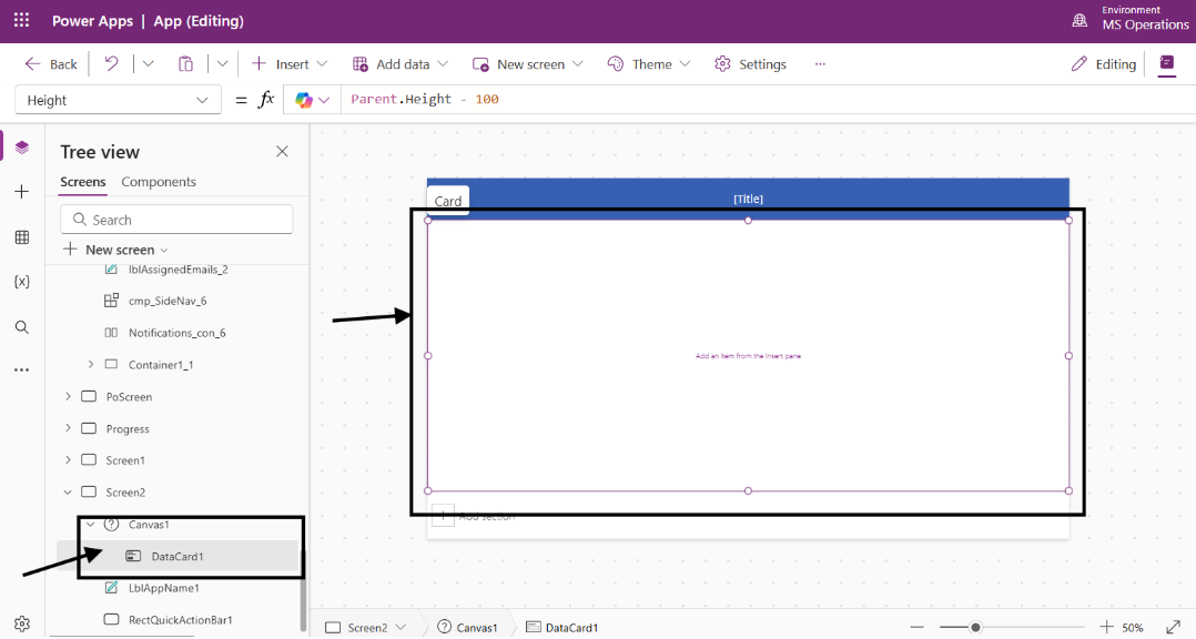
Making Content Auto-Expand
Make the mailBodytxt AutoHeight On. So it will take only what it needs. We need to make the container flexible as well.
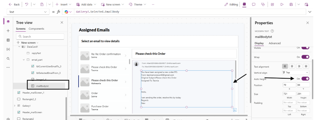
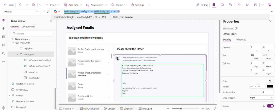
Set the container height to:
mailBodytxt.Height + mailBodytxt.Y + 50So it will grow based on the mailBodytxt height. 50 is for keeping some extra space.
Adding Reply Gallery
Now adding the reply gallery inside the reply container and designing it the same way.
Notice how the content appears stacked up and the mail body cannot be read properly. Set the text body to AutoHeight On.
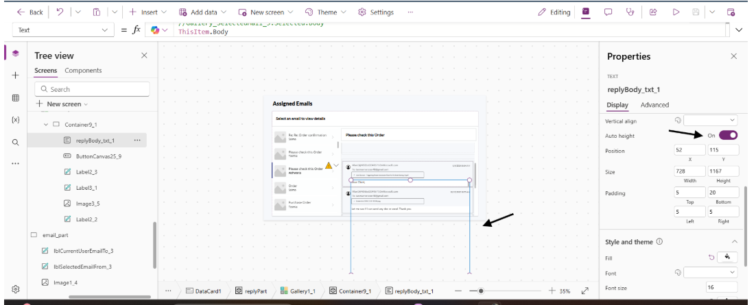
The container needs to grow with the size as well. Make the height of the container:
replyBody_txt_1.Height + replyBody_txt_1.Y + 30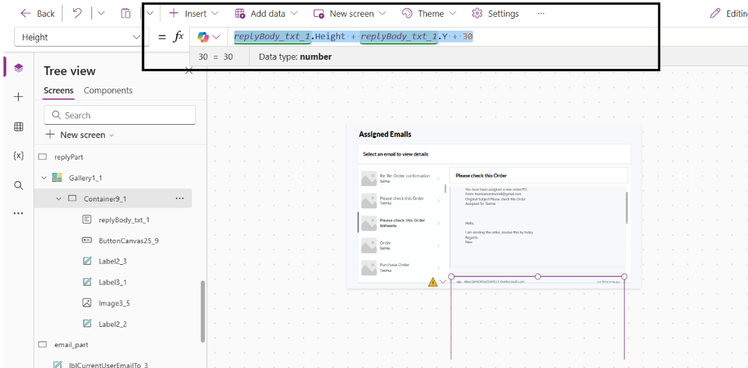
This is how we can show all the gallery texts in a very user-friendly way.
Conclusion
Designing proper scrollable containers in Power Apps requires thoughtful planning and understanding of control behaviors. By combining containers, HTML Text controls, and smart data loading strategies, you can create user experiences that rival native email clients. The Outlook mail reader use case demonstrates how these principles apply to real-world scenarios, but the pattern is adaptable to any long-content display requirement — document viewers, knowledge bases, or form submissions.
Remember to prioritize performance, accessibility, and mobile responsiveness throughout your design process. With these considerations in mind, your Power Apps will deliver exceptional experiences even when handling extensive content.